Five Wedding Color Palettes, From Five Real Weddings
Advice about wedding colors tends to float free of any actual wedding. So here are five palettes we built, the venues they were built for, and what made each one work.
A palette is not a paint chip. It is a set of decisions about light, season, and the room you will stand in — and the same five hex codes that look effortless on a moodboard can go flat at a real venue at seven in the evening. Every wedding below was designed for a specific place, and in every case the place had a vote.
1. Blush and ivory, in open air
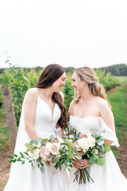
For a vineyard ceremony in high summer we kept the bouquets to dusty rose, cream, and ivory, with silver-green eucalyptus threaded through. In a landscape that is already green in every direction, the greenery in the bouquet is what ties it to the setting — the soft pinks read as color precisely because everything around them doesn't.
2. Wine and blush, in the woods
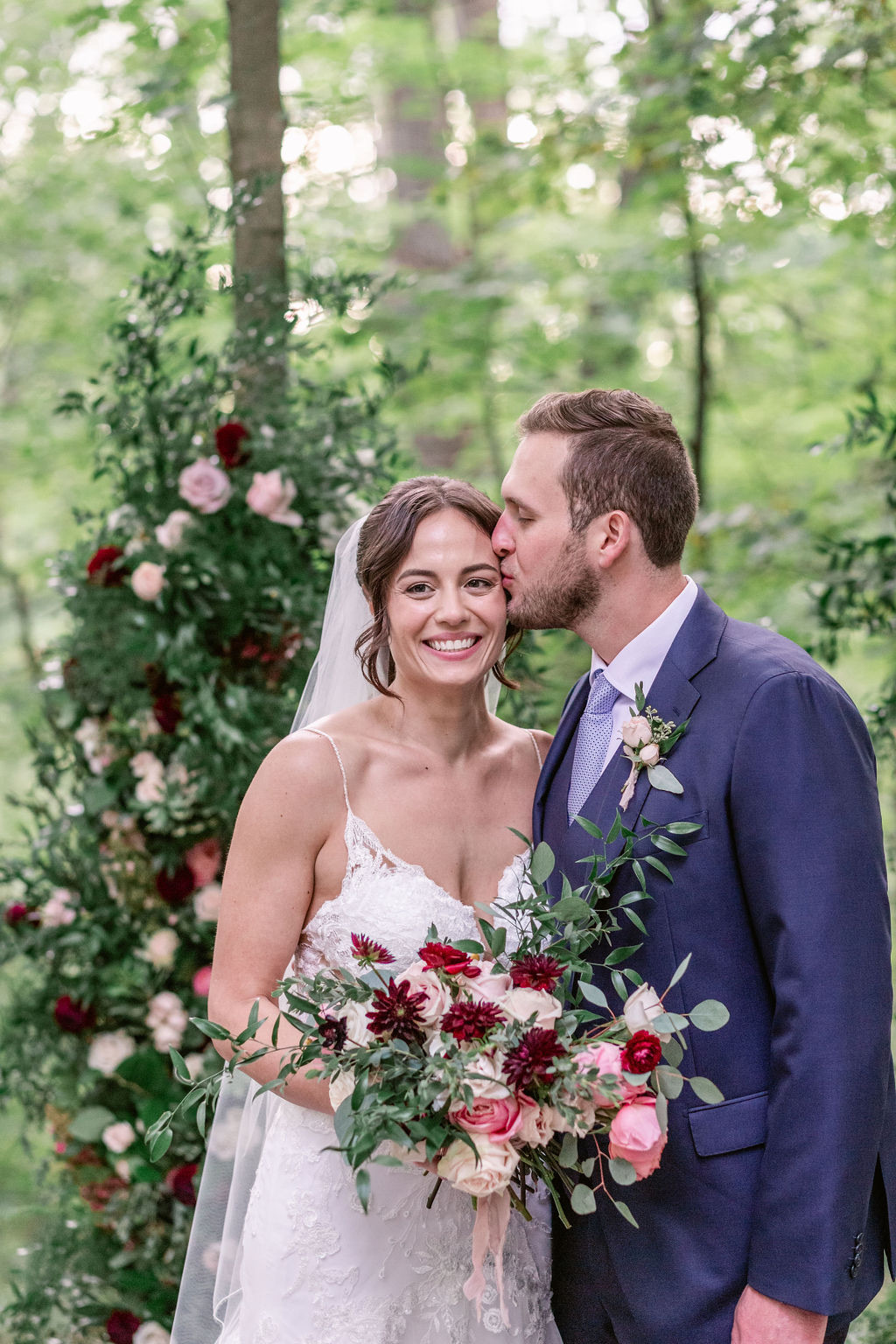
Deep woods flatten pale palettes; there is too much shade for ivory-on-ivory to carry. Here the answer was contrast — wine-dark dahlias against blush roses, repeated at the same proportions in the ceremony piece and the bridal bouquet, so the photographs read as one design rather than a collection of separate arrangements.
3. Sunset tones, late in the day
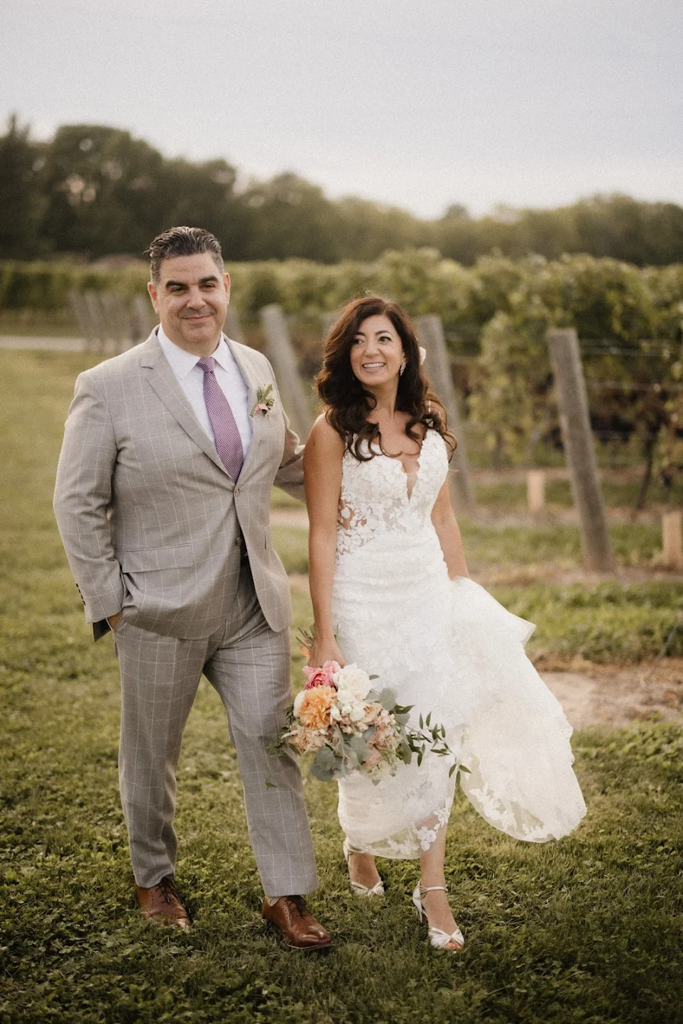
This bouquet was designed for golden hour: peach, coral, and toffee tones that deepen as the light warms instead of washing out the way cool pinks can. Against a pale grey suit and an evening vineyard, it was often the strongest color in the frame — which was the point.
4. All white, black tie
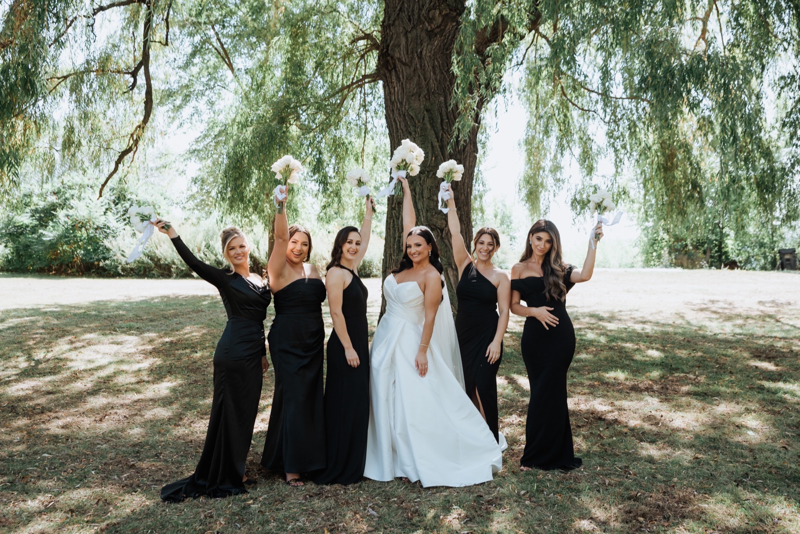
When the wedding party wears black, the flowers do not need to compete — they need to be crisp. Compact, all-white bouquets gave every photograph a graphic quality: black, white, green, done. The restraint is the design.
5. Soft pastels, down a long table
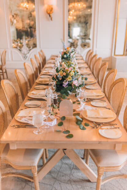
One long table changes the arithmetic: guests look across the flowers all night, so everything stays low, and the palette has to be gentle enough to live with for four hours. Soft yellows, lavenders, and pinks in loose garden runs — with the room's cream walls and cane-backed chairs doing the quiet work around them.
How to actually choose
Start with the venue and the hour, not with Pinterest. Name the two or three colors you want to feel — not ten. Then let the season pick the flowers: the blooms that are naturally available on your date will always look more at home than the ones flown in to approximate a screenshot. It is the same way we are approaching our new home — the Hill Country light around Austin is warmer and stronger than what these weddings were photographed in, and it will reward the warm palettes on this page generously.
Every wedding above has a full gallery on our portfolio.
Planning your own?
Our look book walks through the palettes, installations and process behind the weddings we design.
Send me the look bookAlready have a date? Start an inquiry